RED FOX PROPERTIES
The identity for Red Fox Homes is built around the simple but memorable idea of transformation. Red Fox is anything but flip about the homes they renovate. The level of care from the team ensures the highest quality of workmanship in each home, and they wanted a mark to reflect this attention to detail.
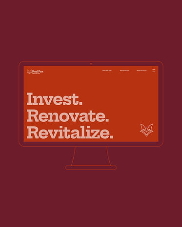
At first glance, the logo appears as a fox, representing the company's name and resourceful approach to home renovation. Turn it upside down, however, and the mark becomes a house—a visual nod to the art of house flipping itself.
This dual-meaning design captures the essence of the business, turning overlooked properties into desirable homes. It's a logo that embodies the brand promise: when a house is flipped well, you know it had to be Red Fox.
LOGO DESIGN